
2023 art portfolio
Stain Glass Inspired Digital Art

Jenna Sumberg
Written STATEMENT
My portfolio was focused on the themes and style of stained glass. Stained glass has many themes that come to mind when you think of it; angels, godliness, purity. My idea was to contrast these expectations of what Christian centric stained glass usually presents as unequivocally good, by presenting my own themes that invert them. Things like a connection to nature, loss of purity, the beauty of a feminine body, and trauma. I learned a lot about art and how I can push the boundaries of my own art style with this portfolio, and I’m so glad I chose to do it primarily digitally, just to hammer home how much my art differs from the stain glass inspiration.
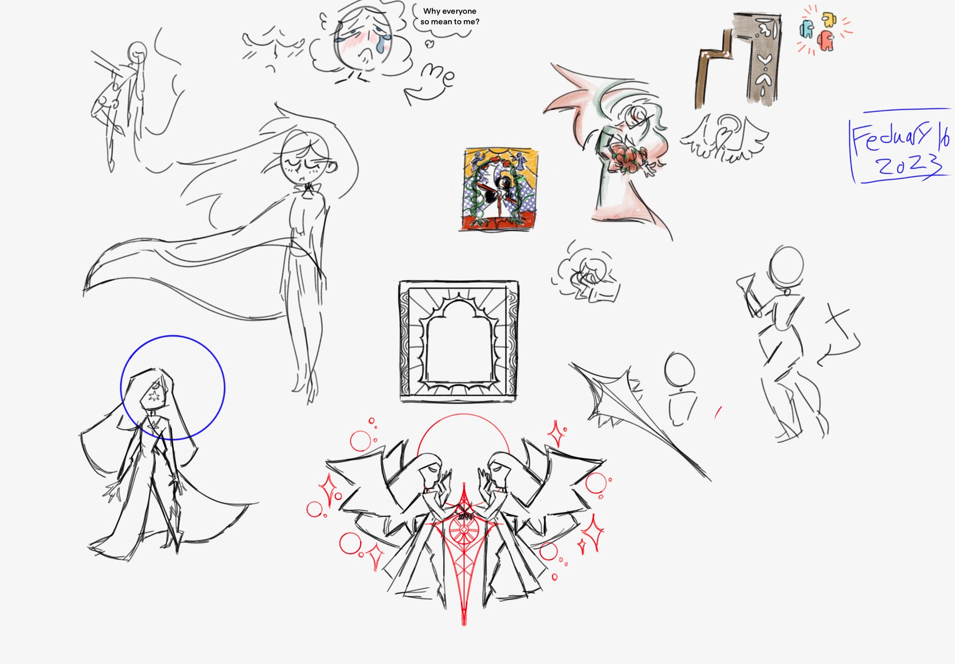
concept sketches
piece Number #1:overtaken
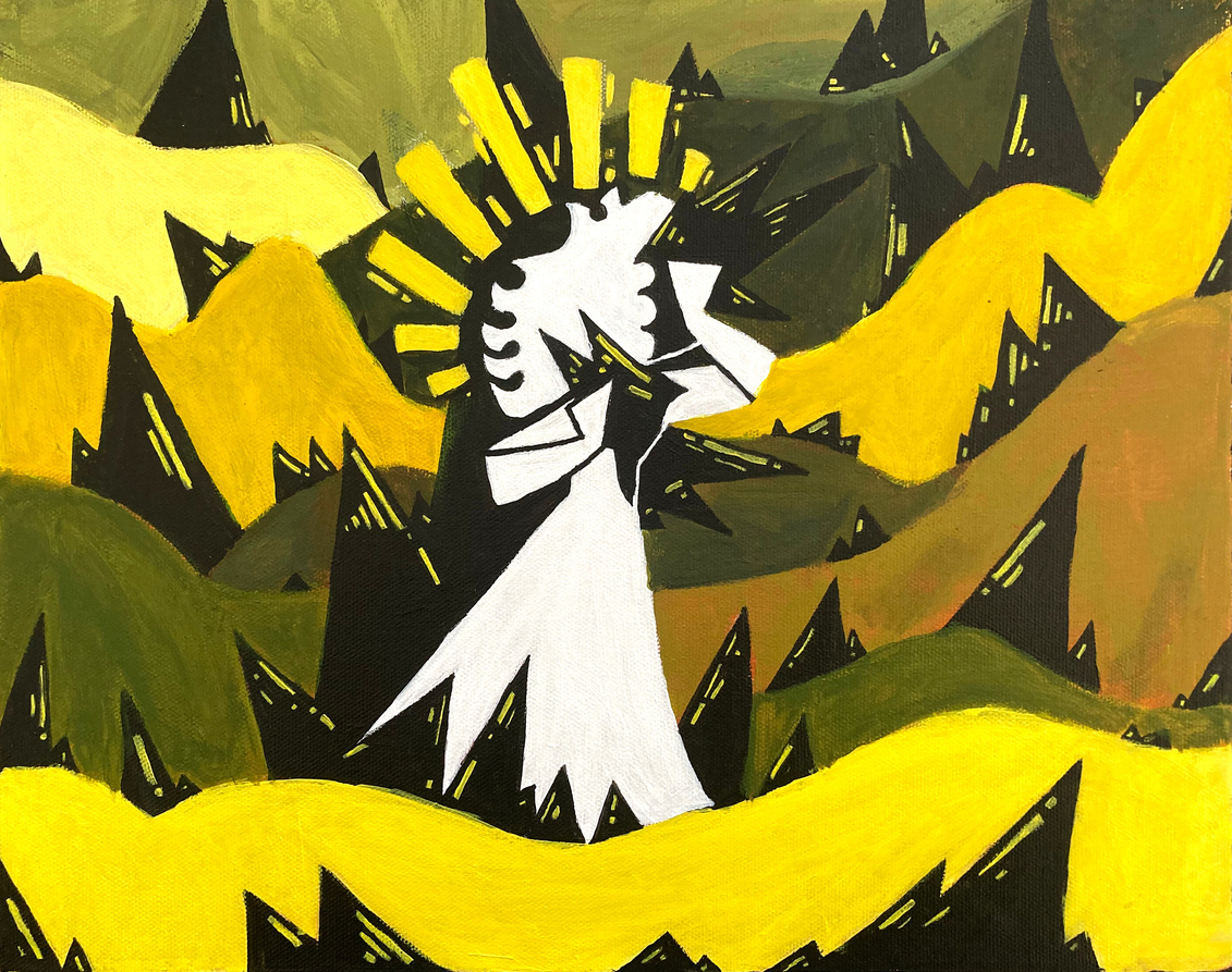
One of two painted pieces in the portfolio, and the first I made the year. My original intention was to paint every piece, but digital offered more in the way of exactness, which was important in trying to emulate a stain glass style.
piece Number #2: GRASPING for life
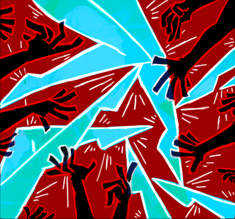
This was a piece still was very much in the "color block" stage of my portfolio. This originally was made in response to a prompt that challenged me to make a piece incorporating hands and feet. I ended up going for the idea of the lustrous and pure legs, being reached for by corrupt hands, all just barely not touching them. If I could change one thing about this piece in retrospect, I would add a border of some kind, I think it would make it all just that much better.
This is another piece made in response to a prompt. I was instructed to draw a real life location, but I decided to put my own spin on it and make it a bit more other worldly. I like this piece for its simplicity in a lot of ways. I always looked at it like a window in the literal sense. To a place I'm not meant to see. Or a keyhole into another room, that I can only get a glance at, into a place so far removed from mine it only looks like strange shapes.
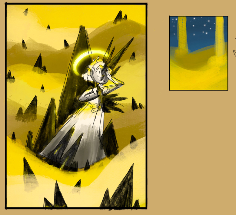
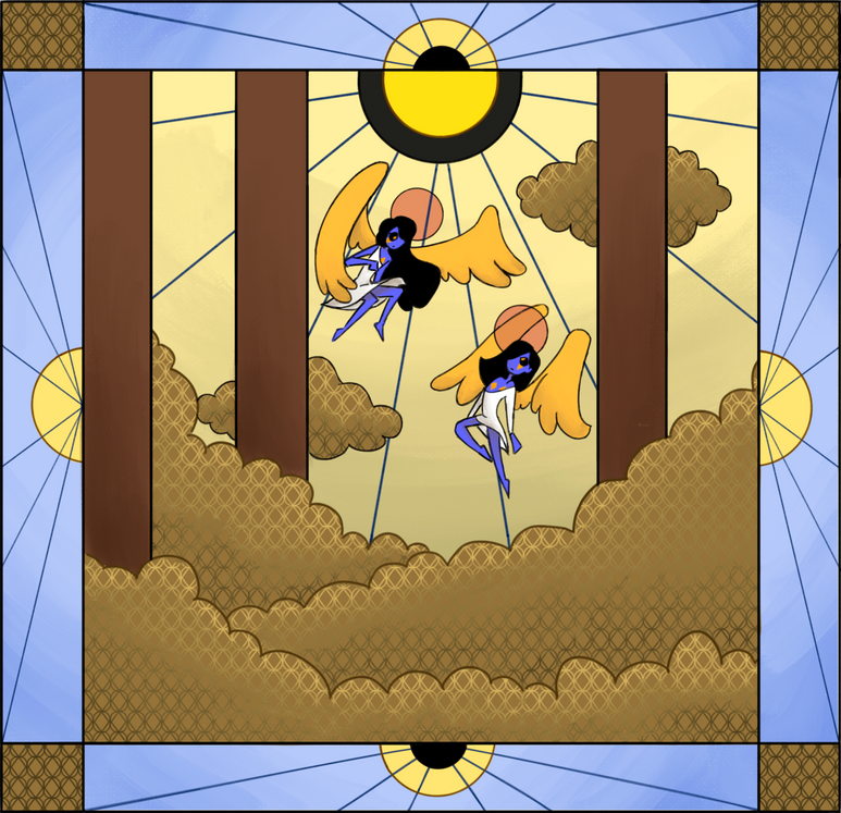
piece Number #3: angels in commute
piece Number #4: captured in a rose window
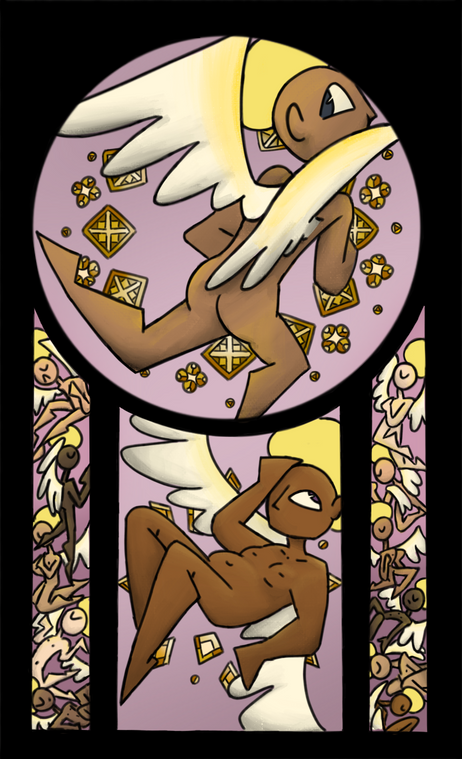
This was the first digital piece. I deliberated over this one for a very long time, it was hard to know what I wanted to incorporate, what it would mean about later pieces, how it would affect my later creative process- in a lot of ways it felt like the real first piece of my portfolio, at least to me. The claustrophobic feeling of the women trapped in the windows was the main idea, feeling trapped by the rose window. Hens the name. In a way, it's mostly about subservience, of being forced to not take up too much space. Weirdly this piece has a lot of stress wrapped up in it, but so do a lot of other pieces in my portfolio.
I wanted badly to start leaning more into the darker themes that were intended for my
portfolio. At the time,
I was mostly using
all black backgrounds to
signify where a real
life wall would be if the
widow was a real stained
glass window, and I think I used that to my advantage here to give more of that straining, lonely, dangerous aura.

concept sketches
piece Number #5: ripped to life
piece Number #6: what is within
I had deliberated on this one a lot. The colors switched around a lot, and while I do like it there’s aspects about it I would change in retrospect. The focus on hair was a deliberate theme, that I represented a lot throughout my portfolio. Hair has such an emotional meaning for a lot of people, including me, and it can represent a sort of sense of freedom. Long hair also has ties to a natural way of living, drawing to mind images of people with flowing uncut hair living one with the earth.
piece Number #7: rain from the heavens
This was a piece made after two separate scrapped works in progress, so I was nervous for how the piece would fair. I ended up liking the result, though it does feel comparatively light in tone then the rest of my pieces, the girl wearing a sundress with the rainbow in the background, it's a bit more relaxing then the others, maybe even childish. Not that its bad, I think that in every one is a part of us that enjoys something a bit more childish.
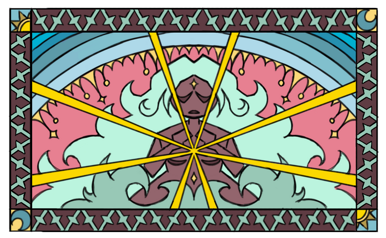
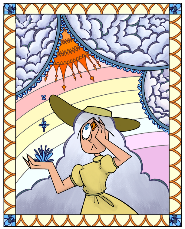
piece Number #8: holding up the cosmos
I could easily argue
that this is my
favorite piece in
the whole portfolio.
The way that it's
drawn feels most true to my every day style of
art, when I don't try to stretch outside of my comfort zone like my other piece. That's not to say I didn't try anything new with this one. The use of repeating star shapes within the doorway like shape behind the girl was the first time I had ever tried something like that, and it ended up very useful later in the portfolio.
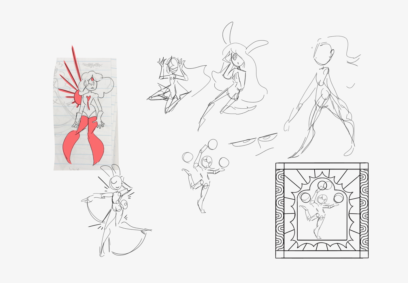
concept sketches
concept SKETCH
This piece started out very unsure. It took me a long time to figure out what I wanted to do, but I ended up strangely taking a bit of inspiration from designer bags, like Gucci. The inspiration was mostly unintentional but I have no problem with it ending up the way it did.
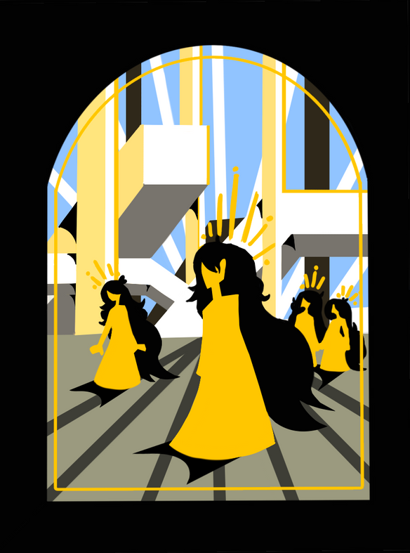
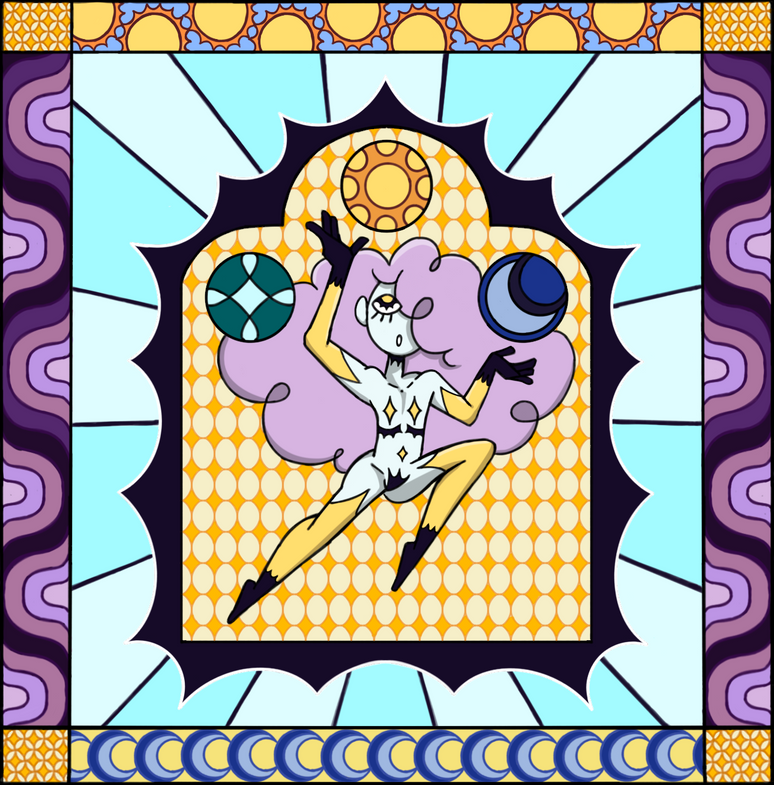
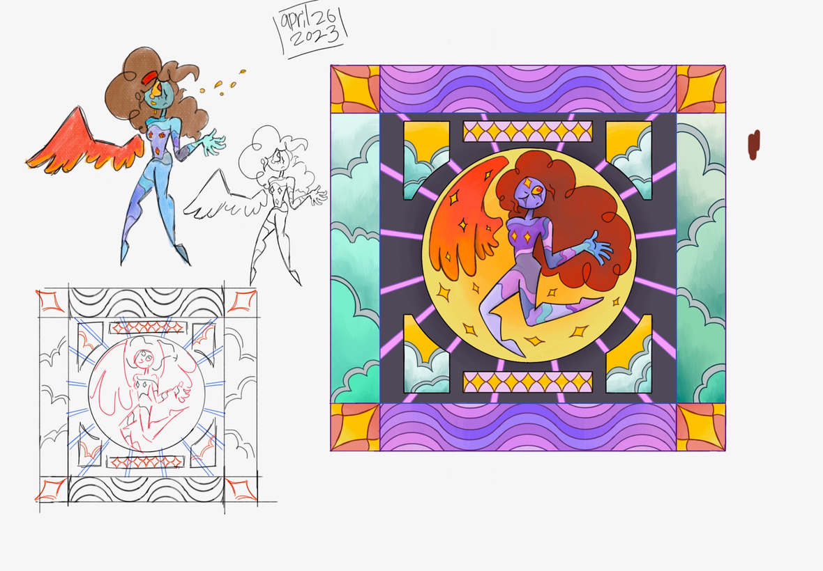
piece Number #9: kingdom of the sky
piece Number #10: citizen of the stars
I wasn't originally a fan of this one, but it quickly grew on me. I adore the colors, and I think the figure in the middle looks
awesome. I used a lot of star imagery throughout my portfolio, namely the four pointed version. it represented a lot of things, and the placement of the forehead of the character was to represent the importance of the mind within this piece.
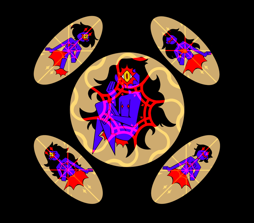
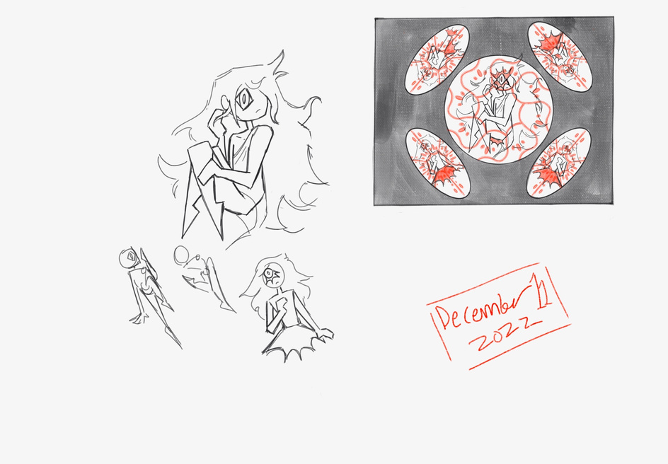
concept SKETCHes
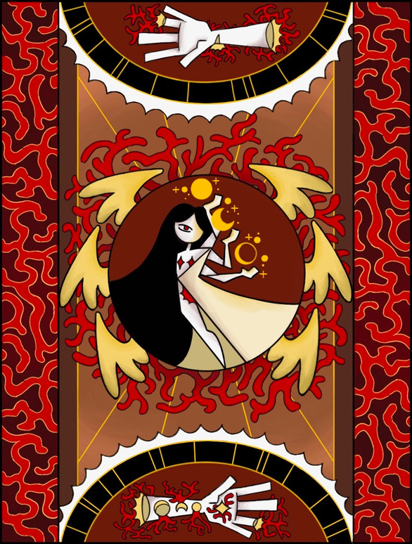
I was inspired by the patterns I'd seen in another piece from an artist from my class. The pattern inspired a design ended up looking a much like veins. next was to design the female character that sits In the middle of the piece, and her three arms and one eye was a striking look that ended up being perfect. after that the pallet of red gold and white fell into place.
concept SKETCHes
piece Number #11: angle in vein
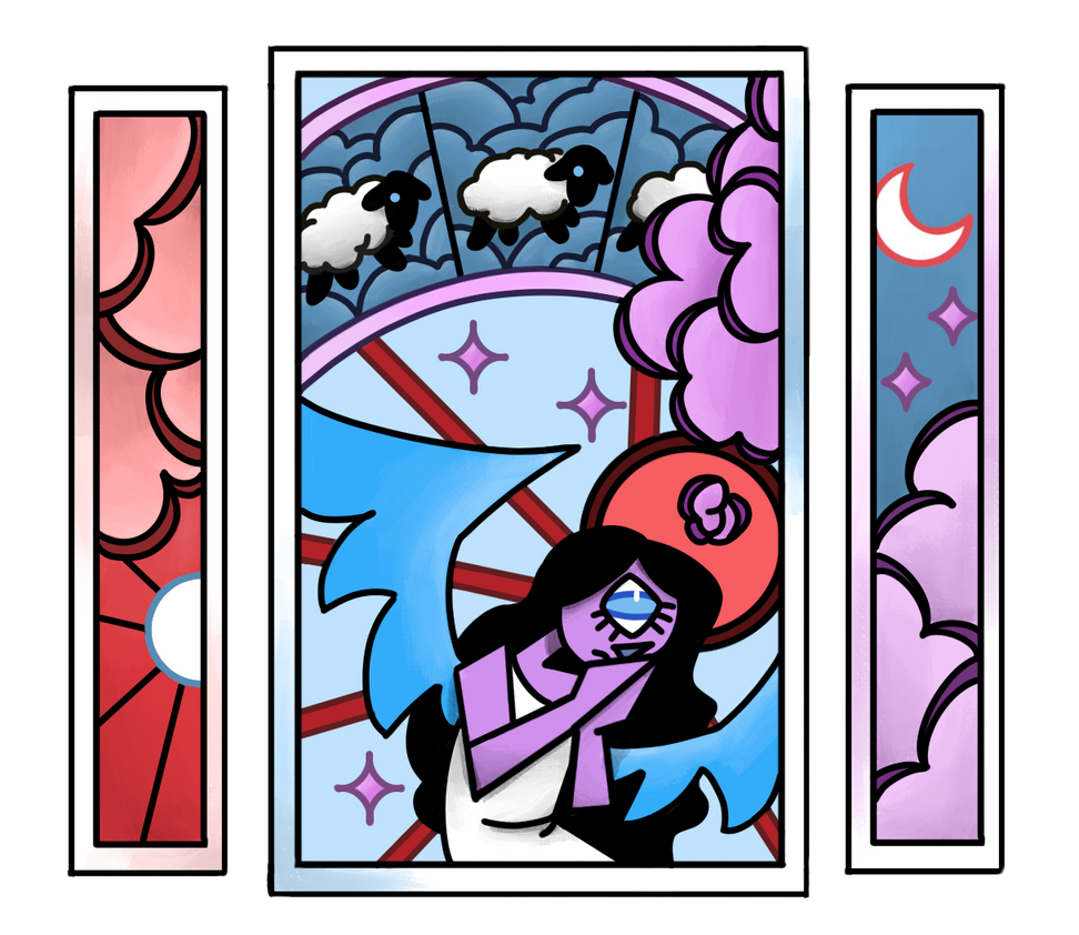
piece Number #12: wakeful sleep
This one started out in concept being a lot darker, but it got a bit more cotton candy in palette. Still though, I like the duality to the pallet being light and dark. It’s taking colors from both night and day time, but I picked a more intense red and blue, to accent the feeling of being in between day and night, while you can’t sleep.
concept sketch
concept SKETCHES
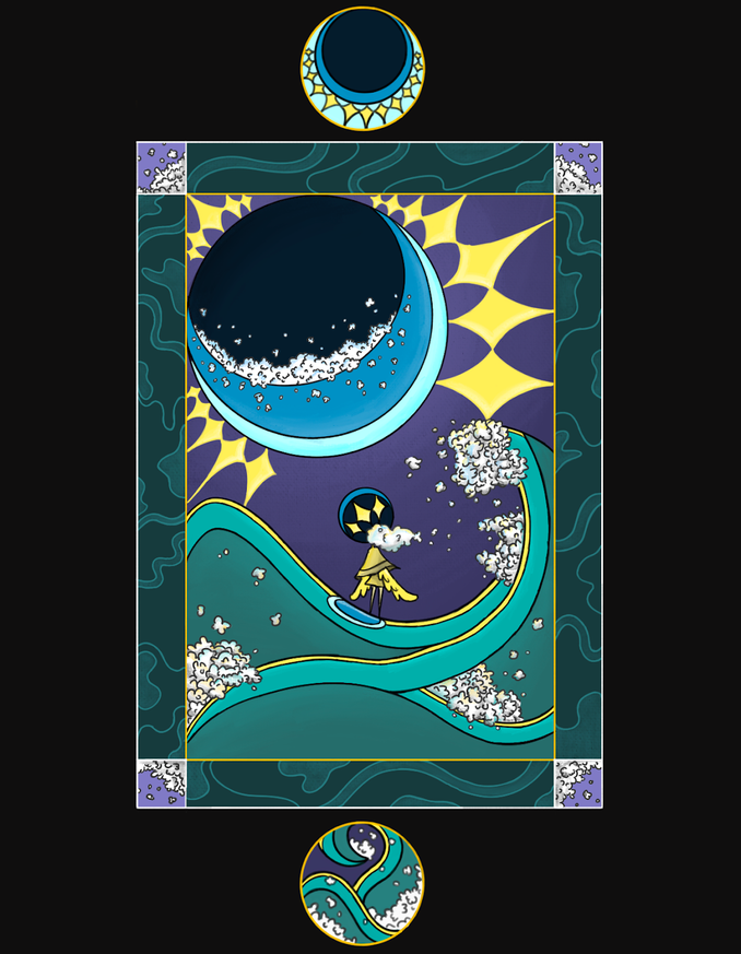
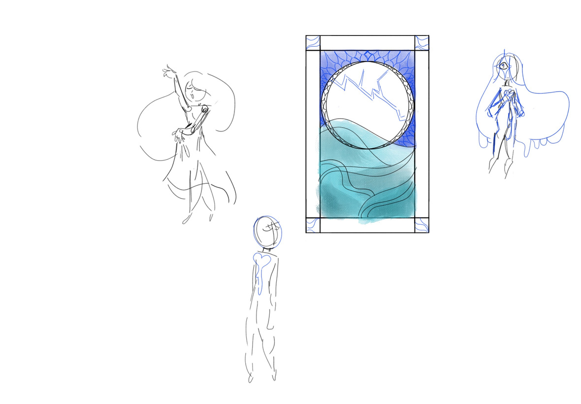
I was sad that the girl in the middle ended up so small, but in a way she’s the biggest thing in the piece if you notice the girl is connected to the moon. The original sketch in that inspired this also inspired Citizen Of the Stars, but both of the pieces ended up very different. I was most of all in this piece trying to show the danger of the ocean and nature.

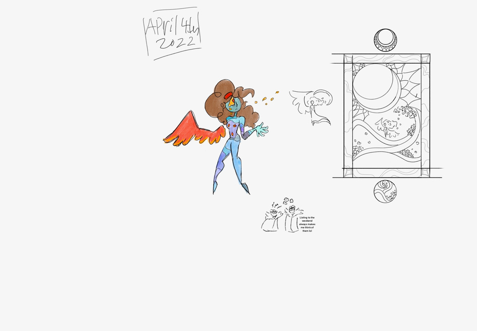
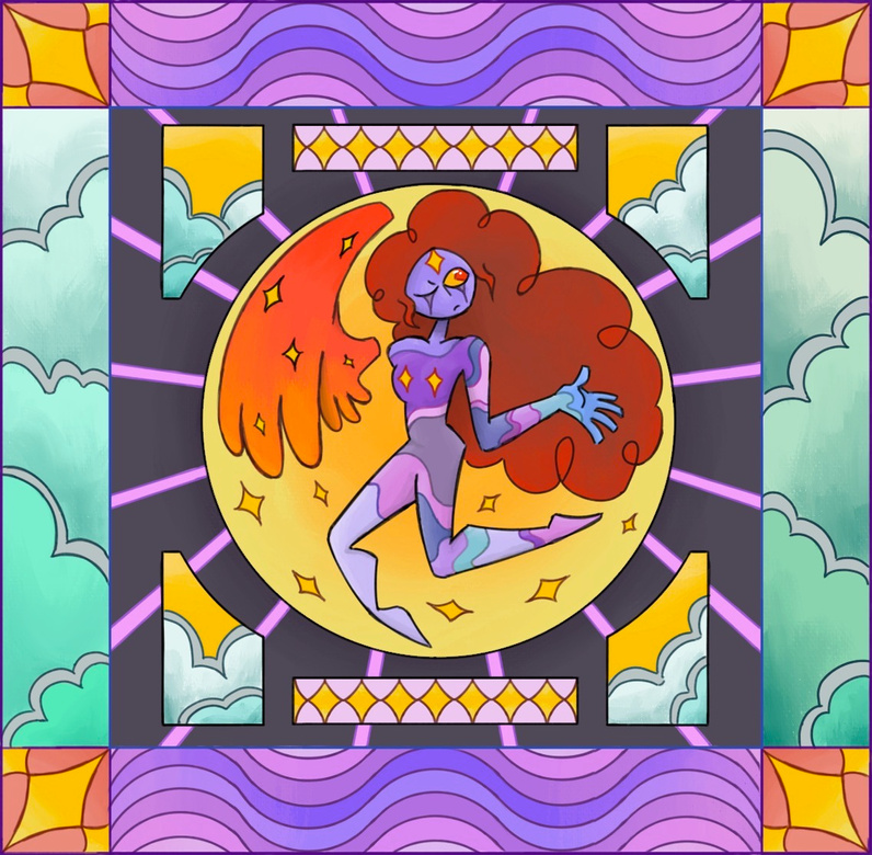
piece Number #13: waves of the moon
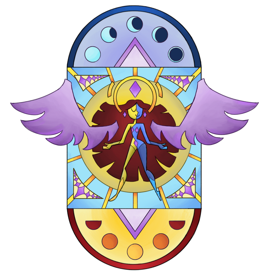
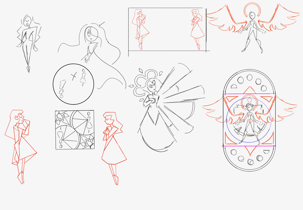
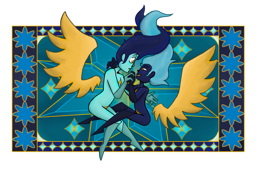
piece Number #14: duality from within
This is the last piece I ever made for the portfolio. There was a part of me that thought perhaps I should make the
last piece super unique but
the piece is admittedly a
bit repetitive looking at other pieces in the portfolio. Never the less, I think it looks really good for what it is, and the way the wings go off the side is a very nice touch, definitely a good choice placing it at the end of my portfoli’s line up.
concept SKETCH
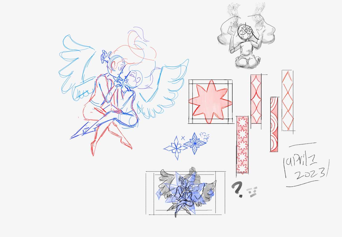
The sketch that inspired this one is nearly a year old, but I think it looks perfect. I won’t hide it, I absolutely love this piece. The colors and pose most of all. I really wish I had tried drawing more detailed hands earlier in the portfolio because I think they look great here, as opposed to the hand shaped triangles from the first few pieces. I suppose I wasn’t as good at drawing hands to start.
concept SKETChes
piece Number #15: burning cold TEMPTATION
five selected quality works
links to other artist from my class!